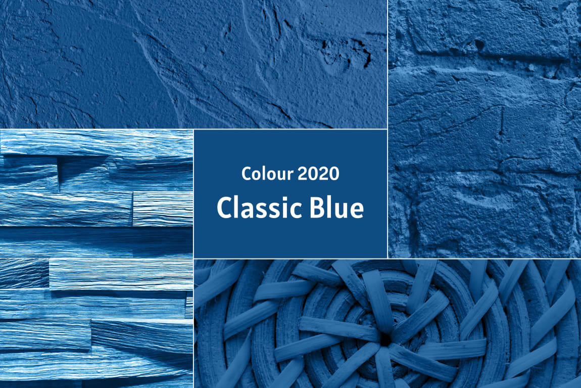
Pantone Color of the year 2020

Something that introduces variety and creates identity for consumers can be a tangible financial advantage for companies: recognising (or even setting) trends. So the Pantone Color Institute not only tracks down colour trends for the months ahead, but also has special teams of creative people with a finely-tuned radar for identifying sociocultural developments and working out predictions on this basis. These ideas are then picked up by diverse sectors: fashion, interior design, automotive industry, paints/inks etc. This year inspiration is drawn from traditional and familiar colours: blue is the Germans' favourite colour. And that obviously makes them bang on trend for 2020!
In times when the world is perceived to be unstable and overwhelming, two basic directions are emerging: people long for peace and tranquillity, as well as dependability. They are nostalgic for traditions, harking back to the past. Yet mainstream tendencies are increasingly embracing the diverse technology now on the market, and exploring new ways forward. That's also expressed through choice of materials and colours.
The Pantone Color Institute has defined a shade of mid blue as this year's trend colour: PANTONE 19-4052 Classic Blue. The classic blue encourages a clear, focused way of thinking, allowing individuals to order and structure their thoughts better, say the trend researchers. At the same time this reflective blue hue also conveys optimism and vitality.
"In this day and age we need trust and hope. The PANTONE 19-4052 Classic Blue shade, a solid representation of constancy and reliability, positively radiates this assuredness. The intense character of PANTONE 19-4052 grounds us firmly in the here and now. PANTONE 19-4052 Classic Blue, which stands for the endless expanse of the evening sky, appeals to us to broaden our horizons, focus our ideas, adopt new perspectives, and communicate freely and without preconception."
Leatrice Eiseman EXECUTIVE director, Pantone Color Institute Source: https://store.pantone.com/de/de/color-of-the-year-2020
In past years, although darker shades of blue were popular, the preference was to use them as accent colours for furniture because of their cool character. Dominant colours at the moment include sand and natural shades, muted pink, warm fabrics and natural materials like wood, fur and leather, and blue balances well with these. Along with intense green hues, this will define the direction of the furniture sector over the next few months.
Blue gives off an aura of calmness, confidence and clarity that satisfies the desire for a safe and dependable fundament
